Header Bars#
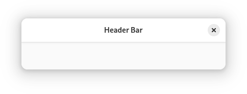
Header bars are a standard element that span the top of windows. They allow windows to be dragged, are the site for window management features, and contain app controls.
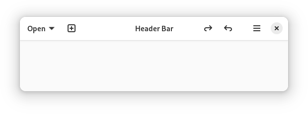
Header bars often include:
Buttons for the main user actions, such as new, add, open and back. These are placed at the start of the header bar (on the left in left-to-right locales).
A window heading, which is placed in the center (sometimes this is replaced with a view switcher.)
Menus, which are typically placed at the end.
Guidelines#
Arrange controls within the header bar according to the three alignment points — left, center and right.
Header bars should only contain a small number of controls. This helps people to understand the primary functionality provided by the window, and ensures that the window can be resized to narrow widths.
The content of header bars can — and should — update along with view or mode changes, so that different controls are shown depending on the content of the window. This ensures that header bar controls are always relevant to the current context.
Always ensure that there is some blank space in the header bar to allow it to be dragged.
Primary window header bar controls should all have tooltips.
Button Style#
As far as possible, header bar buttons should appear without a visible background or border. This style is automatically applied to types of button where it is known to work effectively, including buttons with an icon only, buttons with an icon and label, and split buttons.
Types of buttons which don’t automatically have their appearance adjusted when in a header bar include buttons with:
a text label only;
the linked style.
These button types should generally be avoided for primary window header bars, since it leads to a complex and inconsistent visual appearance. To achieve this, icons can be added to label-only buttons, and spacing can be used instead of the linked style (see below). Note that these guideline do not apply to action dialogs, which can safely retain their label-only buttons.
For more information, see the toolbar style class documentation.