Checkboxes#

Checkboxes allow users to control binary options or properties. In general, switches are preferred to checkboxes. However, in some situations a checkbox may be more suitable.
Guidelines#
Checkbox label guidelines:
Use sentence capitalization for checkbox labels. For example: Use custom font.
Label checkboxes to clearly indicate the effects of both their checked and unchecked states. For example, Show icons in menus. If the two states of a checkbox cannot be clearly communicated, consider using two radio buttons instead, so that both states can be given labels.
Avoid negative checkbox labels, as this can be confusing and hard to understand. For example, Play alert sound is better than Disable alert sound.
Other checkbox guidelines:
Clicking a checkbox should not affect the values of other controls. However, it may affect their sensitivity or visibility.
If toggling a checkbox affects the sensitivity of other controls, place the checkbox immediately above the controls that it affects. This helps to indicate that the controls are dependent on the state of the checkbox.
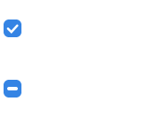
Mixed States#
Checkboxes can represent properties or settings for multiple items. If a property or setting is set for some items in the selection and unset for others, show the checkbox in its mixed state.
When a checkbox is in its mixed state and the checkbox is clicked:
Once: check the box and apply the setting to all the selected objects.
Twice: uncheck the box and unset the setting to all the selected objects.
Three times: return the box to its mixed state, restoring each selected object’s original value for that setting.