Progress Bars#


Progress bars indicate progress on a task. Unlike spinners, they typically indicate the proportion of the task that has been completed.
Progress bars are most appropriate for indicating the progress of tasks that take a relatively long time (as a rule of thumb, tasks that take over 30 seconds). For tasks that have shorter periods, spinners are often a better choice.
The Bar#
The bar of a progress bar should indicate the amount of time remaining to complete the task.
Ideally, the remaining time should be calculated accurately. However, if this is not possible, then the remaining time can be estimated. Here, overestimation can be handled by having progress pause at 100%, and showing explanatory text such as “Almost done”. Underestimation can be handled by having progress skip ahead as necessary.
If it is impossible to estimate the remaining time, then the progress bar can be set to activity mode, which causes it to move back and forth without indicating progress. Activity mode should be avoided wherever possible, particularly for long periods of time.
Progress Text#
Progress bars should have a text label that describes how much of the task has been completed. For shorter tasks, this can be expressed using units which are appropriate to the task. For example, “13 of 19 images rotated” or “12.1 of 30 MB downloaded”.
For long-running tasks, it can be desirable to show an estimate of the time remaining, either on its own, or with supplementary progress information. If the time remaining is an estimate, use the word “about“. For example, “About 3 minutes left”.
Task Stages#
Some tasks can be made up of a series of stages, each of which has a separate time estimation. In these situations, try to create a single composite calculation of the remaining time for the entire task. Only communicate the different stages in a task when it is relevant to users.
In some cases, it is possible to calculate or estimate the time remaining for part of a task, but not another part. In this situation, a progress bar can enter activity mode for part of the task. However, it is best not to show activity mode for long periods of time, and the number of progress bar mode changes should be kept to an absolute minimum.
Subtasks#
Some tasks are comprised of multiple simultaneous subtasks (such as downloading several files at the same time). Here, it is generally advisable to show a single progress bar that indicates combined progress for all tasks.
In rare cases, it might be desirable to show a progress bar for each individual subtask. However, only do this if it is genuinely useful for the user to know progress for each subtask, or if it might be necessary to pause or stop a subtask.
Thin Progress Bars#


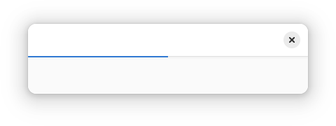
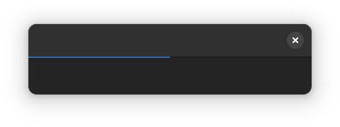
For situations where task progress happens in the background, and accompanying text isn’t as important, a thin progress bar can be used. These are smaller than regular progress bars, don’t show accompanying status text, and are attached to the bottom of the header bar.
See the style class documentation for details.
General Guidelines#
If an operation is potentially destructive or resource-intensive, consider adding pause and/or cancel buttons to the progress bar.
Where possible, progress bars should be displayed inline, and should have a close visual relationship with the content items or controls which represent the ongoing task.
In the past, progress windows were a popular way to present progress bars. These secondary windows would appear for the duration of a task, and would contain one or more progress bars. In general, progress windows are not recommended, since the consequence of closing the window can be unclear and they can obscure useful controls and content.