Toasts#

Toasts are popup banners that contain a label and sometimes a button. They are always transient and user dismissible.
When to Use#
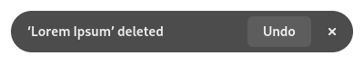
Toasts can be used to show messages and actions in the context of using an app. Typically they are shown in response to a user action. One common use for toasts is to show an undo button after a destructive action.
Toasts are transient and are therefore best suited to communicating individual events, as opposed to ongoing states. The latter are better served by banners.
Since toasts are only shown in the context of an app’s window, they are only appropriate for feedback that is useful while the app is being used. If it is useful for a message to be visible while the app is not being used, a notification is probably a better choice.
Guidelines#
Each toast should have a short and simple title.
Toasts shouldn’t always include a button. Only include one if it is directly relevant to the message that is being communicated, and will be generally useful.
Toasts should be positioned towards the bottom of their parent window, and should be horizontally centered. They shouldn’t be placed over a particular area.
Toast titles should use the informal heading style.