Switches#

Switches can be used for controlling features, settings or hardware that have a clear on/off logic.
When to Use#
Switches are analogous to real-world controls, and this real-world correspondence can be used as a guide as to when a switch should be used.
On the whole, switches are preferred to check boxes, since they offer a larger click target, often fit modern UI layouts better, and are more action orientated. However, check boxes may still be used if a switch doesn’t seem appropriate.
Only use a switch to control options that have a clear binary nature. If the switch label cannot adequately communicate what both states of the control do, a radio button may be a better choice.
General Guidelines#
Label switches with nouns using header capitalization. For example, Automatic Location or Notifications.
Give the label an access key to allow users to focus the control using a keyboard.
Switch States#
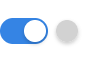
The active/inactive state of a switch is communicated by its background color, and this can be changed independently of the actual switch position. This can be used to communicate when a service or feature has been switched on, but has not yet come online. This technique can be particularly useful when there’s a delay between the switch being toggled and it having an effect.
If a feature has been disabled or is unavailable, it is better to make the switch insensitive, since this avoids the suggestion that the service ought to respond to user action.