Buttons
A button is a clickable UI element that typically contains text or an icon. Whenever it is clicked, it performs an action.
Text buttons
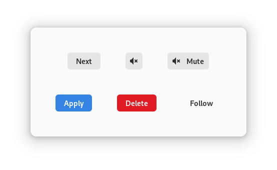
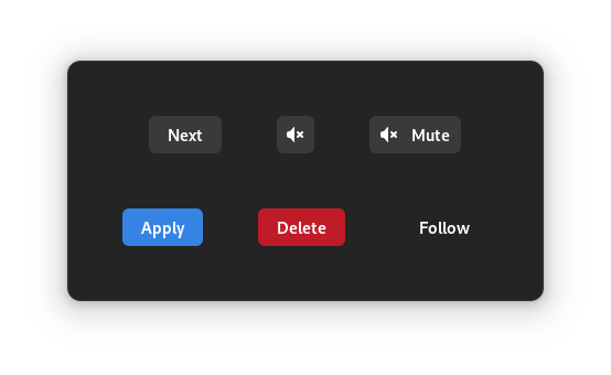
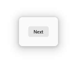
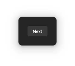
Text buttons are buttons with a GtkLabel as a child. By default, text
buttons will have the text-button CSS class assigned to them.
<object class="GtkButton">
  <property name="label">Next</property>
</object>
Image buttons
Image buttons are buttons with a GtkImage as a child. By default, image
buttons will have the image-button CSS class assigned to them.
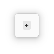
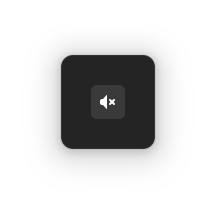
<object class="GtkButton">
  <property name="icon-name">audio-volume-muted-symbolic</property>
</object>
Custom buttons
You can decide the contents of a button by setting its child directly, both programmatically or in .ui files. For instance, if you want to have a button with both a label and an image, you can pack the individual widgets into a box, and set the box as the child of the button:
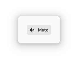
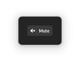
<object class="GtkButton">
  <property name="child">
    <object class="GtkBox">
      <property name="orientation">horizontal</property>
      <property name="spacing">12</property>
      <child>
        <object class="GtkImage">
          <property name="icon-name">audio-volume-muted-symbolic</property>
        </object>
      </child>
      <child>
        <object class="GtkLabel">
          <property name="label">Mute</property>
        </object>
      </child>
    </object>
  </property>
</object>
Mnemonics
If your buttons contain text, it is a good idea to give them a mnemonic (that is the underlined character that can be activated when holding the Alt key).
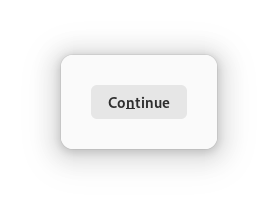
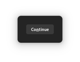
To do so in a .ui file, you can use the following:
<object class="GtkButton">
  <property name="label">Co_ntinue</property>
  <property name="use_underline">True</property>
</object>
Notice the last property, use-underline: it is the important piece here.
Without it, the button label would display the _ between the o and the
n.
Default widget
In a dialog, one widget may be marked as the default, which means that it will
be activated when the user hits Enter. Often, it is appropriate for a
button to be marked as the default widget. In the simplest case, you can make
a button the default by calling gtk_widget_grab_default(); you must also
set the GtkWidget:can-default property for this to work.
gtk_widget_set_can_default (button, TRUE);

// "window" is the top level window that contains the button
gtk_window_set_default_widget (window, button);
button.props.can_default = True

# "window" is the top level window that contains the button
window.set_default_widget(button)
button.can_default = true;

// "window" is the top level window that contains the button
window.default_widget = button;
button.can_default = true;

// "window" is the top level window that contains the button
window.default_widget = button;
button.setCanDefault(true);

// "window" is the top level window that contains the button
window.setDefaultWidget(button);
One more detail that is good to know about default activation is that hitting
Enter while the focus is in a GtkEntry will only activate the default
widget if the entry is marked as ‘activates-default’.
gtk_entry_set_activates_default (entry, TRUE);
entry.props.activates_default = True
entry.activates_default = true;
entry.activates_default = true;
entry.setActivatesDefault(true);
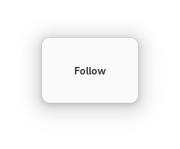
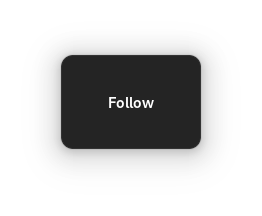
Styles
Buttons can be given a distinctive visual style, which can be appropriate in certain situations.
Suggested action
While most buttons have a neutral color some of them can have a different style, to emphasize buttons that are the suggested action in a set of potential choices. In the default theme, the suggested action color is blue.
Note
Suggested actions are typically tied to the default widget. While default activation is more about behaviour, the suggested action is more about the visuals. If you want the one, you probably want the other too. For more information, you should follow the GNOME human interface guidelines.
To mark a button as suggested action, add the suggested-action style class
to it.
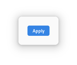
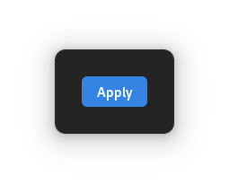
In a .ui file, this looks as follows:
<object class="GtkButton">
  <property name="label">Apply</property>
  <style>
    <class name="suggested-action"/>
  </style>
</object>
Destructive action
Buttons that perform an action that is potentially destructive can use the
destructive-action style class:
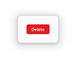
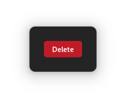
In a .ui file, this looks as follows:
<object class="GtkButton">
  <property name="label">Delete</property>
  <style>
    <class name="destructive-action"/>
  </style>
</object>
Useful methods for a Button widget
set_has_frame()will give a button a “flat” appearance, by adding aflatCSS class
API references
In this sample we used the following: